Walk into a school exhibition and notice what students do first. They don’t read long text panels. They look, touch, and test. If the space is clear, they stay longer. If not, they move on in seconds. I’ve worked on STEM events where one simple change clear goals per zone doubled student engagement within a day. So, what makes an educational space work? It’s not just design. It’s structure, clarity, and action. Let’s start with the basics that shape how students learn and move through the space.
Clear Learning Goals for Each Zone
Each zone should teach one clear idea. Not two, not five just one. This helps students focus and remember. For example, a physics zone may show “how force affects motion.” Keep labels short and direct. Use no more than 15–20 words per panel where possible.
Set a simple outcome:
- “Push and see speed change”
- “Match parts of a cell”
Group content by age level. Younger students need more visuals, less text. Older students can handle short data points. When goals are clear, teachers can guide faster, and students move with purpose instead of confusion.
Hands-On Activity Stations for Active Learning
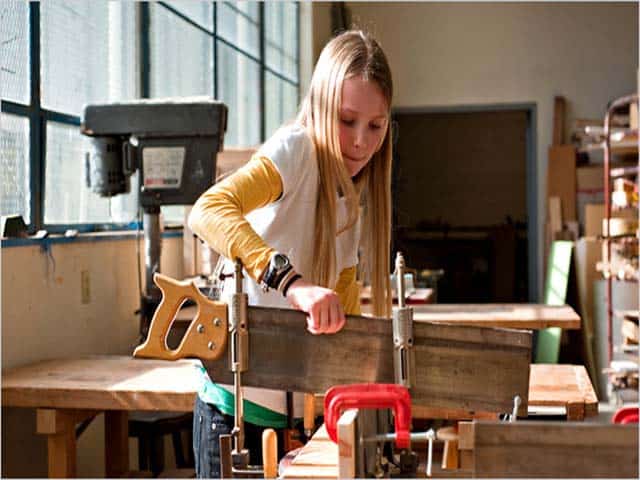
Students learn more when they act, not just watch. Hands-on stations turn ideas into real experience. In one STEM fair I helped design, a simple circuit-building table had the longest line all day. Why? Because students could test and fix their own work.
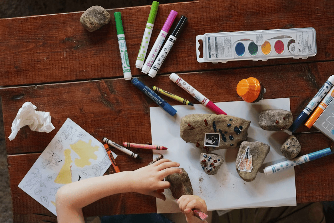
Each station should include:
- Clear step-by-step instructions (3–5 steps max)
- Safe tools and simple materials
- A quick reset method for the next group
Add short prompts like: “What happens if you change this part?” This invites thinking, not just action.
Place stations near seg lightbox displays with clear visuals. Bright backlit graphics help students understand the task before they start. Also, assign one staff member per two stations to guide and keep flow smooth.
Keep time per activity under 5 minutes. Short cycles mean more students can take part without long waits.
Visual Displays That Explain Concepts Step by Step
Good visuals reduce the need for long text. Students should understand the idea within a few seconds of looking. Use large diagrams with labeled parts. Show the process in clear steps, not all at once.
For example, in a biology zone:
- First, show a simple cell diagram
- Next, highlight each part one by one
- Then, add a short label for each part (one to three words)
This method works better than dense text. I’ve tested both formats at school events, and step-based visuals always hold attention longer.
Use contrast and spacing to guide the eye. Avoid placing too many elements close together. Clean layout helps students focus on one idea at a time.
To improve clarity:
- Use bold lines for diagrams
- Keep icons simple and easy to read
- Limit text to key facts only
Backlit panels, such as seg lightbox displays, improve visibility in indoor halls where light is uneven. They keep colors bright and text readable even from a distance.
Avoid clutter. One idea per panel is enough. When visuals are clear, students spend less time guessing and more time understanding.
Interactive Digital Tools for Deeper Understanding
Digital tools help students test ideas at their own pace. A touch screen with guided steps can explain a concept faster than a long talk. I’ve seen this at STEM fairs where a simple simulation like changing gravity or speed kept students engaged for minutes, not seconds.
Use tools that give instant feedback. When a student selects an answer, show the result right away. This helps them correct mistakes on the spot.
Effective options include:
- Touch screens with short lessons (under 60 seconds each)
- Simple quizzes with clear right or wrong results
- Simulations for physics, math, and coding basics
- Audio support for younger users
Keep the interface clean. Large buttons, short text, and fast response time matter more than design style. Also, limit each session to 2–3 minutes. Short use cycles allow more students to take part and keep the area active.
Real-World Examples to Connect Theory and Practice
Students often ask one key question: “Where is this used?” Real examples answer that fast. When they see how a concept applies in daily life, it becomes easier to understand and remember.
For example, instead of only showing a math formula, link it to a real task like measuring a bridge or planning a route. In one event, we showed how sensors work by linking them to traffic lights. Students quickly connected the idea to something they see every day.
Use simple formats:
- Display common objects with short explanations
- Show short video clips (30–60 seconds) of real use
- Add before-and-after examples to show results
Avoid long text. Focus on clear links between theory and use. When students see the purpose behind the concept, they stay longer and ask better questions.
Modular Booth Design for Flexible Layout
A modular booth allows quick changes without full rebuild. This is useful for schools that host different topics across events. Light frames, panels, and movable parts help adjust the layout in hours, not days.
Key features to include:
- Panels that can be replaced for new topics
- Light structures that are easy to move
- Clear paths for group flow
I’ve used modular setups where one booth changed from physics to robotics overnight by swapping panels and props. This saves cost and time. A flexible layout also helps manage crowd size, as zones can expand or shrink based on need.